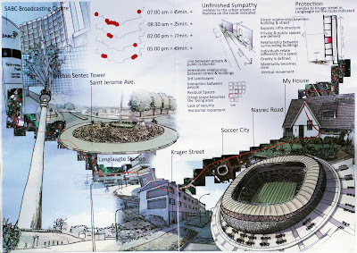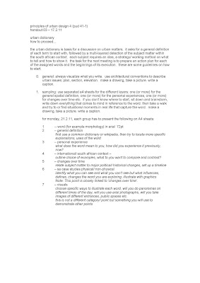
17.2.11
urban dictionary schedule update
21.02. crit
24.02. hand in printed material for feed back
28.02 feedback
03.02. crit
07.02. final pin up/ marking hand in
24.02. hand in printed material for feed back
28.02 feedback
03.02. crit
07.02. final pin up/ marking hand in
13.2.11
handout 01 – 10.2.11
3 tasks.
urban scripting – de/constructing site through narrative and documentary structure
every space has a story to tell. rooms, buildings, and cities all house memories of their evolution and existence. some stories are literally written in walls, from hieroglyphics to stained glass, while others are triggered by the experiences and memories of a space’s inhabitants. yet even within a range of growing explorations, documentary form in particular has remained an underutilized resource for spatial and analytical inquiry.
diane davis-sikora, ucla’s journal of cinema and media studies, fall 09
before we start writing urban scripts, we try to learn how to read. tell 3 stories of existing spaces based on the following:
1. photography exhibition
in/out – a photography by laurence bonvin at the market photo workshop in newtown, #2 president street. visit the exhibition and look carefully at the blikkiesdorp series. choose one image. take a picture of it. analyse the photograph spatially, then research the background | history of the project. re-construct the urban design framework that might have resulted in a settlement like blikkiesdorp (layout, density, location, number of units, public space, infrastructure, access, costs, target group (who is supposed to live there), client (who has commissioned the project)).
2. newspaper
choose any recent article with photograph that you consider part of an urban design process. this may relate to any of the following subjects: public space, transport, housing, art or infrastructure. describe the process and the consequences the event might have. identify the different actors that are part of the process.
3. dictionary
one of the tasks of the studio is to construct a spatial dictionary, verbal and visual definitions of urban design vocabulary. define access within the south african context. the definition should cover multiple scales and time.
tasks 1, 2 + 3 are to be graphically presented on single a4 sheets of paper (portrait). be cognizant of layout + eligibility. work should be clear, concise and most of all, touch on challenging urban issues.
pin up on 14.2.11, 8am, 4th year studio.
reading: a moving city, rory bester, from johannesburg circa now, published by terry kurgan and jo ractliffe in 2005.
prepare min. 3 questions to discuss on monday.
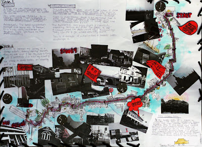
this is an accessible project. task 1 was explained. whether the observations are accurate or not is immaterial. they are the authors observations. clearly a careful and vigilant distinction was made in dissecting the 2 films and some acute, honest impressions were made. the only lacking component here were the graphics which were plentiful in task 2. the author emphasized task 2 and made it their own. it seems they had fun yet still still managed to communicate and highlight the essence of the task in a playful and fun way. nice touch on the urban story. it is refreshing to have a personal opinion thrown in there for personality’s sake. beautiful drawings and collage make it a fun to crit project. the only criticism was that some of the black and white pictures were a little too dark. but all the key components were evident such as time, direction, typology, views et al. a descriptive + analytical work. a very good project. well done.
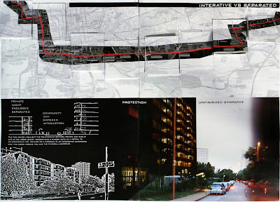
project begins with the two movies highlight the relationship between private and public life in the urban realm. peering into a window acts as a portal to an individuals life. walking on a sidewalk in a interactive experience with the users around you and the physical landscape. spot on, but then what? this cannot be the end of the analysis. task 2 is more informative. the linear east - west direction is well illustrated with points of interest highlighted on the route by images. what do the colour and black and white images signify? a narrative would have taken care of this problem and also would have taken us to the author’s position and feeling. satisfying layout with a clear distinction between the 2 tasks. next time, push the analysis. good work.

task 1’s matrix is enticing. the movement from horizontal ground to verticality as depicted by the redline works well in unpacking the films. just as the private | public thing. unfortunately the analyzing discontinues there. the themes mildly explored should have been taken further and a more critical assessment of the 2 films would have supported the project to reach a higher plenitude rather than a mundane one. another short trip from auckland park to fada whereby people, trees + buildings were mapped. why stop there? if one does stop there, then a more interrogative rendering should have been employed. the trip is short, the mapping could have been intense. the beginnings of beautiful work, but more intensity is required and you have to push yourself to go beyond the mediocre. satisfactory work.

commendable 3 dimensionality of the project. architecture and urbanism are 3 dimensional so this is a fascinating beginning to something. the staticness of the representation of the films make it quite difficult to access the information. for example, why are they 15 cutouts frames for unfinished sympathy [not symphony] as opposed to 17 for protection? does this have to do with time? why are some of the frames blank? the journey frames are more interesting and communicative because they fall away like dominoes depicting, i guess, direction. the project could have gained strength if the author used a flipbook method. the frames could be animated. this would have lent the project more of a narrative giving it more of a flowing storyline than a static one. more work and more layering required to stretch and go beyond satisfactory work.
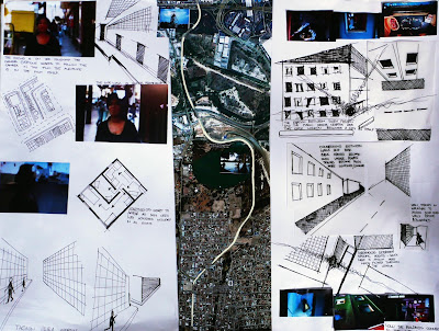
an interesting page and layout but somewhat thin on context and information. there are some astute and acute observations in task 1, especially the horizontal vs the vertical plane and the idea that each window becomes a city in itself. this concept could have been pushed further, just as the concept of apartments appearing as mini cbd’s. the drawings need an explanation to oriented the viewer just as the aerial in tasks 2 needs points of interest along the route. clearly the author travels quite a distance from bed to class. this is substance for a rich narrative as they traverse the city in a south to north direction. a lost opportunity. satisfactory work.
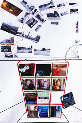
well presented work which leaves numerous question unanswered such as what do the chosen colours signify in both tasks? what is the difference between the colour images and the black and white? task 1 is somewhat confusing and not very accessible. what is the panel ultimately saying? should we be reading something in the 3 x 4 grid arrangement of the photographs? the films were meant to be critically analyzed, interrogated and not repackaged in a cool way. clever use of a time layer in task 2, but the trip is from where? text and context could have advanced the project. somewhat satisfactory but thin work. challenge yourself.
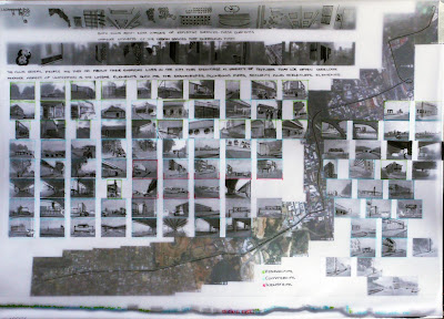
the format of the page is very beautiful. the combination of the film stills (once you remove the transparent illustrated page), photographic journey and contextual aerial map are the beginnings of a compelling narrative. the section running at the bottom of the page further intensifies the latent drama. but alas, just as it takes off, the narrative crashes. the transparent layer begins to resuscitate the story but also ends. was this because of not enough time? not understanding where to go? what? the text on his page demonstrates that the author had a semblance of comprehension of the task. the line the films reveal people as they go about their everyday lives in the city. they showcase a variety of textures that we often overlook confirms that the author understands the task. issues of space, time, distance et al should have been explored on the 2nd sheet of paper, telling us a coherent story. the beginnings of good work.
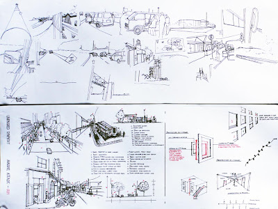
this is an example of truly rich, intense but constrained work -- a broken poem, an amputated dream. in task 1, the unpacking of of unfinished sympathy is pleasure to explore. very clinical and well executed. it's wonderful to see what is a linear, horizontal action being taken into an overhead dissected street shot. nice touch of point 8 to contextualize the graphic. the drawings speak for themselves and the legend gives an even magnificent layered residue. the only thing missing is the author's position in all this. where is your opinion? your voice? something to guide us through to what we are seeing? the same comments are applicable to protection. don’t stop at describing, move to analysis and then say something to then say something else. task 2 are incredible illustrations which, unfortunately remain incredible illustrations. the graphics need text, context and . . . and . . . and . . . more. a map from point a to point b was the exercise. get there. both sheets need to talk to each other and reinforce the same story. that being said, this is the genesis of very good work. let us hope the momentum is not lost or distracted.
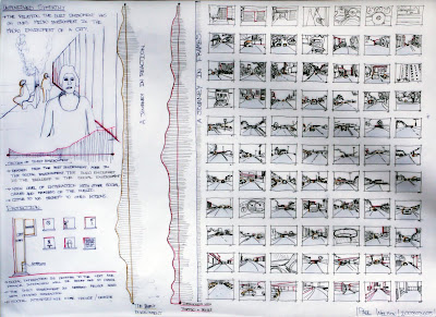
task 1 could have been a more discerning and perspicacious layer. the drawing of shara nelson takes up too much unjustified space and what is it communicating? also the lift + windows in protection convey very little meaning. these have to work in tandem with the text to articulate a narrative. a legend would have assisted in accessing a journey in reaction graphic. the project get very meaty in task 2, a journey in frames. clearly the author had fun with this component of the project. the frames are priceless renderings. rich, beautiful + engaging. but they stop there. what do the numbers mean? if i am in frame 3, 23 or 45, where am i? a plan + text are more than necessary here to grant life and locality of the frames. then a rich storyboard would have emerged, guiding the viewer through a journey in frames. this is a pity because the missing layer/s betrays the richness and fertility of the drawings. good work.
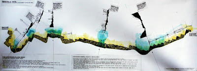
the only project to have done the route backwards as in, from where the person attends classes [fada] to where they sleep. an interesting approach, but why? this should have been explained. excellent unpacking of task 1 -- protection= shelter= hoamage= retreat? delightful equation, but what does hoamage mean? things get better in unfinished sympathy. lines like the everyday journey sculpts the urban perception of the user; factors include desitnation [sic], time span, method of transport (all these factors will affect urban design principles) are a joy to read. and the text gets even better. the only mild criticism is, this could have been explored graphically as an added layer with plans, sections, architectonics et al. that being said, it doesn’t take away from the strength of the text. be mindful of spelling errors. the journey from fada through brixton, boysens, southdale flats, kliprivier to home is well rendered with alluring + charming sections enhanced with a textual layer. the morphology of the city, as a plan, draws one in, but this could have been taken further from mere “fine art” illustration to actual city grain + morphology. also a timeline + distance layer would have added more value to an already rich and splendid piece of work. this is an example whereby the expression of the work justifies not respecting the format. excellent work. keep it up.
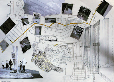
an interesting, beautiful + alive page where task 1 doesn’t exist. the journey is from where to where? direction, time, economy? clearly the journey begins at 13 [13 what?] and terminates at fada, which is clear from the well depicted illustrations. a text layer + a legend would have greatly improved what already is well thought articulation to being a far superior project. next time your page should tell the entire story, regardless of the whereabouts of the author -- always seek standalone work. that being said, the commencement of very good work.
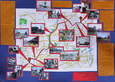
presentable layout. this was another work which combined the 2 tasks. would have appreciated an analytical dissection of task 1. task 2 was diligently done containing some minor spelling errors. as nice as it is to hope, one hops out of a vehicle. the journey component of the project is thorough, with beautiful photographic vignettes of the different kinds of experiences along the route. it would help in future to critically analyze the problems and also to layer them with otherness such as distance, time, economy + feeling. good work.

interesting page layout. task 1 appears no where. what is the reason for this? task 2 makes a bold attempt at rendering the journey in a interesting way. love the use of the images to supplement the aerial. the numbers help orientate the viewer to actually come with on the journey. the confusing part are the words and the esoteric drawings between boksburg city and johannesburg. what do the purple dots signify? the text: scale, density, services, populations and infrastructure add nothing to the page, except take up valuable space. satisfactory work.
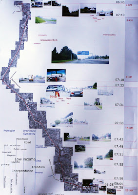
task 1 is inaccessible. task 2 comes alive with the aerial route supplemented by the author’s images. wonderful layout with very limited sound effects. i very much doubt that on a 25 km journey all one hears is beeb, beep, wwwsssshhh, f*@&, hi + hello. it is refreshing to see a timeline and distance being applied to space as a layer. a narrative would have helped in articulating some of the points along the journey. good work.
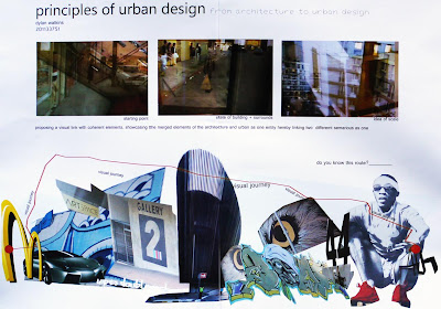
another thin project. not quite sure what task 1 is attempting or what the sentence means. even more confused by what semarious means. task 2 appears as an interesting collage with some sexy pictures, but what do they mean? clearly the journey begins at Mc Donald's [is that where you live?] and terminates . . . where? too much of a repetition of the words visual journey. i think without the words one gets that its a visual journey. lacking.

a confusing piece. the presented task 1 should have been the initial concept and observations as you watch the films -- if it had been, this would have been a rich project. then these would later have been turned into something coherent with proper text et al. task 2 is also thin. this is one project whereby you didn’t have to travel far. the journey is short that it could have been thoroughly mapped. never have text run over images. disappointing work, poor + lacking.
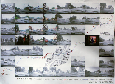
the sheet was entirely made up of task 2 and it was well executed. fresh to see text become a traversing line with red points of interest. a legend is required to access the points making them legible. images do not require to be that size. by making them smaller to give more ‘room’ + ‘space’ to otherness, for example a narrative. issues of section + elevation were ignored. it is difficult to decipher exactly what are the parallels of interaction through public engagement vs personal space in a combined whole. as much as interesting the photographic journey is, the pictures are too similar, except the clips from the films. task 1 was absent. satisfactory composition.
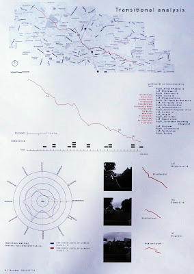
as much as it was interesting to have a positive + negative display of the format, task 1 was a no show. the a3 sheet of task 2 is crisp and the layout is clear. the route would have benefitted more from a narrative. for instance, why were kloofendal, sophiatown and auckland park highlighted? what about roodekrans, noordekrans or cottlesloe? journey would have been enhanced with more images. nice touch with the emotional mapping, but more emotions could have been unpacked, such as joy, surprise and anticipation, for example. a legend of the congestion would have been beneficial. good work with latent potential. open up!
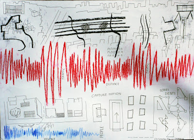
a very difficult to access project with somewhat interesting touches and moments. the frequency bit is interesting, but it would have helped the viewer understand the sequential rows of activity. an explanatory layer is missing. its difficult to tell where task 1 starts and ends and where task 2 is. with more time and critical engagement a superior work would have been achieved. this just made a satisfactory project.
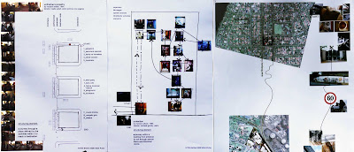
clear, crisp work. the pages are beautiful and communicative. task 1 structuring elements could have been explored further as in the nuances and texture of the films. the mini stills are refreshing and add an interesting layer to the pages. a supportive textual layer would have been key. task 2 is clear. even though pictures speak for themselves, it would have been beneficial to the page to layer it with words. the format should have been respected. very good work only requiring an extra push to take it to another lofty level.

commendable work. you honestly made a strong attempt at deciphering the tasks. you got the point of task 1, as in the spatial differences in the films. excellent work on the plans, sections + structuring elements. task 2 was also well executed, with precise locale as to from where to there. a photographic, timeline, cost or something layer would have nailed the project. as much as the extra sheets are appreciated, the format asked for a single a2 sheet. you can get round this in future by photocopying the work at say, 20%, then including this on the master sheet. overall, very good work.
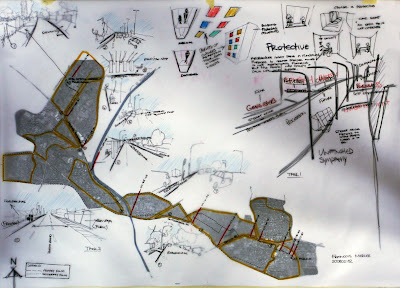
difficult to access the tasks on the page. task 1 is very thin with little or no discernment. where is architecture to urban design? the themes attempted could have been explored further and more coherently. it is almost as if you missed the point of the exercise ad skimmed over it -- task 1: lacking. task 2 was more successful. a bit more clarity in the layout would have enhanced the page as in point 1 -- 9 could have been a more concise legible legend. timeline on the route was most appreciated as a layer. basemap component is strong + clear, as in where you start [allensnek] + where you finish [uj] -- task 2: good.
generally speaking
the tasks were done in a satisfactory fashion with some highs and lows. be mindful of spelling and make sure that you read the brief and understand what it is asking you to do. then you do just that.
handout 00 – 7.2.11
2 tasks.
1. from architecture to urban design.
1. protection: release date: 9.1.95 – director: michel gondry. location: paris – 21.12.94. running time:6m32s.
2. unfinished sympathy: release date: 11.2.91 – director: baillie walsh. location: peico avenue. los angeles – january 1991. running time: 5m20s.
identify the unifying and coherent structuring elements in regards to architecture and urban design within the 2 films. both are music videos done by the band massive attack.
2. demonstrate + articulate your route from where you sleep to where you attend classes [fada]. the same principles as in task 1 should be employed.
you are expected to infer and extrapolate issues of scale, plan, section, elevation, context, materiality, collaborative processes, architectonics + your own voice.
tasks 1 + 2 are to be graphically presented on a single a2 sheet of paper. be cognizant of layout + eligibility. work should be clear, concise and most of all, tell an interesting urban story.
pin up on 10.2.11, 8am, 4th year studio.
Subscribe to:
Comments (Atom)


